
Sometimes it is difficult to know when to conduct a quadratic regression. While there are many approaches to help you make this decision, this guide reviews one of the easiest approaches – creating a scatterplot and visually identifying whether a quadratic trendline fits your data. As always, if you have any questions, please email me at MHoward@SouthAlabama.edu.
A quadratic regression models a relationship using a single curve, such as the “too much of a good thing” effect. If you need a refresher about the purpose of quadratic regression, check out my guide on calculating quadratic regressions in Excel. It is sometimes difficult to know when to apply quadratic regression, but creating a scatterplot and adding a quadratic trendline can help you make this decision. Fortunately, we can do this in Excel.
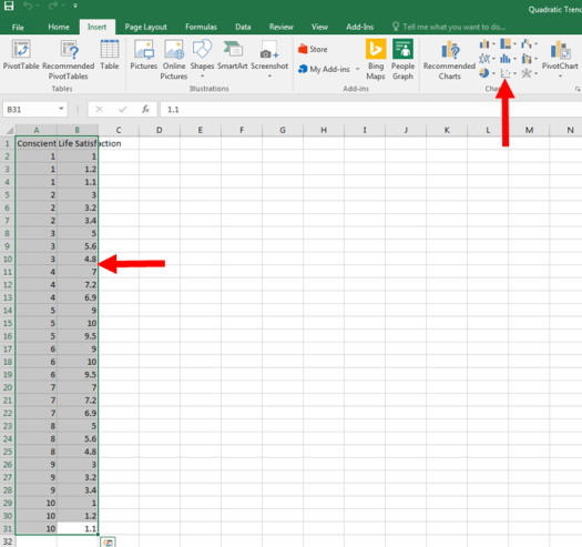
Your dataset should look like this:

As you can see, we have a predictor variable (conscientiousness) and an outcome variable (life satisfaction).
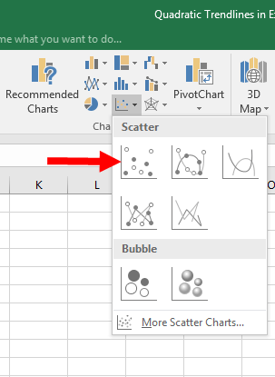
First, let’s start by making a simple chart of the data in Excel. Highlight your data by clicking and dragging, then click on the highlighted button below.
Once you click on that button, a new menu should pop up. Click on the new highlighted button below.
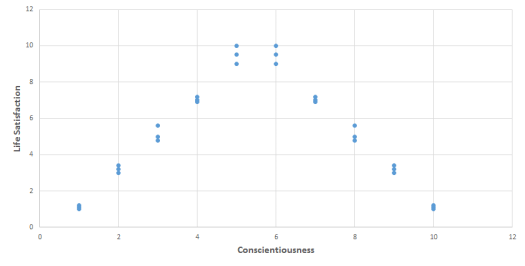
Voilà! We now have a chart! But we aren’t done yet. Make sure that your chart looks like the one below if you are following along with the example dataset.

I went ahead and reformatted it to have correct labels, but this is not required.
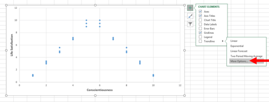
Now, click on your chart. The “+” symbol in the upper right corner should appear. Click on the arrow next to the word, “Trendline”. Then, click on the phrase, “More Options…”. Do NOT click on the word, “Trendline”, or else it will automatically add a trendline that you do not want.
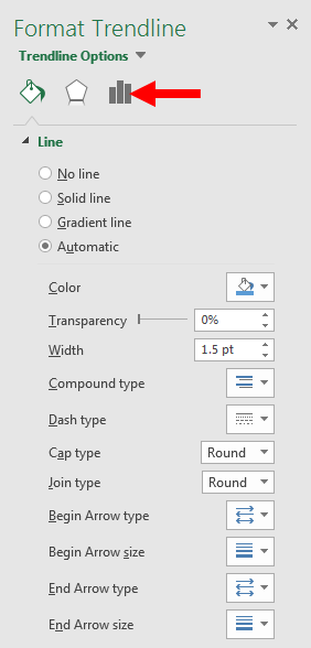
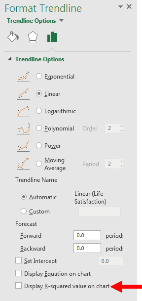
A “Format Trendline” window should appear on the right side of your screen. Click on the mini-bar chart in this new window. It is highlighted below.
A new set of options should now appear. Let’s start by pressing, “Display R-squared value on chart”, at the very bottom.
An R^2 equation should appear on your chart. I made mine bigger for visibility purposes, but, if you are using the example dataset, your equation should be R^2 = 0. This indicates that the current linear trendline on our chart explains very little of the variance in our data. Thus, it is not a good trendline.
Now, try clicking on “Polynomial” on the right-hand side of your screen. Keep it at “Order: 2”. A second-order polynominal trendline is the same as a quadratic trendline.

A new trendline should appear – one with a single curve. Also, your R^2 equation should change. If it didn’t, try clicking on the, “Display R-squared value on chart”, button off and on again, and it should properly reappear.

Now, we see that the quadratic trendline explains 92.5% of the variance in our data. That is a lot! And it also seems that our trendline fits our data very well. This indicates that we should perform a quadratic regression.
From this screen, you can also click on the other trendline options. Try them out to discover new shapes and possible regressions that you can calculate. It is a lot of fun! And email me at MHoward@SouthAlabama.edu if you need more help.
